Internship · Product · 2025
Meituan: When the Algorithm
Can't Move Fast,
Design Can

Meituan is China's largest local-life services platform — think Yelp, Groupon, and DoorDash combined, at 770M+ annual users. I interned on the Tuangou (group-buying) channel, where the core problem was a matching gap: massive supply, diverse user intent, and a recommendation model too slow to close it. My job was to find faster levers.
+9.2%
Filter UV click-rate lift
+0.9%
Daily paid GTV (filter)
+1.3%
Daily paid GTV (card info)
The constraint
The matching gap the algorithm couldn't close — this quarter
Tuangou is a curated marketplace for local deals: restaurants, spas, entertainment, and more. The channel had a structural problem: supply was growing faster than the recommendation model's ability to match it to the right users. Personalization improvements were on the roadmap — but the iteration cycle was measured in months, not weeks.
If you can't move the algorithm fast enough, what user-side interventions can close the matching gap in the meantime?
This became my core product question. The business wanted better human-to-product matching. The constraint was that any solution had to be deployable independently — no dependency on backend ranking changes, fast to measure, and reversible if it didn't work.
Product constraint: Recommendation model iteration cycle is measured in months. Every intervention had to ship independently, show results within weeks, and be reversible without collateral damage to the feed. Small bets, fast feedback loops.
I worked across four directions, each building on the last — from establishing the filter infrastructure, to reading behavioral signals in real time, to rethinking what information a product card needs to carry to help a user decide.
Four-layer filtering + information system
01 Foundation
Party size · Restaurant quality · Time slots · Private rooms
Standardize
02 Scene-aware
Locals' Choice · Frequent buyer · Category-specific
Contextualize
03 Intent-driven
Behavior sequence → real-time prompt → filter selection
0→1 Lead
04 Card info layer
Rankings · Reviews · Entitlements · User history
0→1 Lead

Tuangou channel homepage and post-scroll state — category tabs, quick-filter bar, and recommendation feed. The filter bar is the primary design surface across all four directions in this project.
01
Filter Foundation
Standardize
Before anything could be built, I needed to understand why the filter bar wasn't working. Clickstream data showed the bar existed but wasn't being used — and the reason wasn't discoverability. It was relevance. The filters available didn't map to how users actually made decisions.
But there was a second, structural problem underneath: the filter bar had no governance. Every time a business team had a seasonal promotion or a partner wanted more visibility, they'd request a new filter — with a custom color, a bolder font, a position closer to the front. Over time this had turned the bar into a patchwork of competing priorities, each optimized for a single moment, none optimized for the user browsing through all of them.
Tension
Ops teams optimize for their own filter. Product needs to optimize for the whole bar.
A holiday promotion wants to be first. A partner deal wants a special badge. These are legitimate short-term needs — but without a framework, they accumulate into visual noise that degrades the bar's usefulness for everyone.
Finding
Key decision factors had no filter path at all
Party size — a fundamental "who am I ordering for" decision — was completely absent. Users couldn't express one of their most basic purchase criteria, while promotional filters occupied the prime positions.
I identified party size and restaurant quality as the two highest-priority gaps — both grounded in behavioral data and user decision patterns. I led the product spec and design for both filter groups, ran A/B tests, and drove them to full rollout.
Equally important: I co-authored a filter operations standard — a three-tier taxonomy (Core / Scene-based / Promotional) that defined what each filter type is for, how it should be placed, and how it gets evaluated and retired. The taxonomy was the structural answer to the governance problem: it didn't prevent ops teams from adding filters, but it gave the product team a principled basis for deciding where they go, how they look, and when they come off.
The principle: Visual consistency and content relevance are more valuable at the system level than any individual filter's short-term visibility. The framework made that principle enforceable — not just as a design opinion, but as a product decision with clear criteria.
Result: Party Size became one of the highest-performing filters in the system — single-person filter showed the strongest post-filter purchase rate of any filter we tracked. Private Room filter also showed strong and stable engagement after launch. The operations standard gave the team a durable evaluation framework, reducing the overhead of every subsequent filter decision.

Shipped interaction — Party Size filter (left) and All Categories filter (right), showing the three-step selection flow: tap filter chip → expand options → select and confirm.
02
Scene-aware Filtering
Contextualize
With the filter foundation in place, the next question was sharper: the same filter bar shouldn't serve every user equally. Good filters are only useful if the right ones appear at the right moment — for the right person, in the right context.
Finding
Dining dominates — and dining users want local validation
Food and dining account for the majority of Tuangou channel traffic. Within this segment, users consistently look for social proof — "what do locals actually eat here?" is a stronger decision driver than generic platform rankings.
Finding
Generic filters underserve specific categories
A buffet user wants off-peak timing and student pricing. A KTV user wants room availability. A single filter bar can't serve both efficiently — conditional filter sets needed to activate by context.
I designed the Locals' Choice filter — surfacing restaurants with strong local repeat-purchase signals and high ratings — as a scene-aware filter targeting the dining-dominant feed. I also contributed to the category-specific filter framework, enabling tailored filter sets per vertical.
What shipped vs. what didn't — and why it matters: The Locals' Choice filter reached full rollout and showed strong engagement. It worked in part because the underlying IP — a local dining recommendation list — had already been running long enough that users in the food category understood what it meant and trusted its curation.
The Traveler's Recommendation filter, by contrast, hadn't launched by the end of my internship. The limiting factor wasn't the product logic — it was supply readiness: the list was newer, user awareness was lower, and the tagging coverage across relevant venues wasn't dense enough to make the filter reliably useful. This pointed to a broader principle in local commerce: list-type signals only work as filters when three conditions are met — users have a mental model of the list, the supply is broadly tagged, and the curation quality is legible to a first-time viewer. Without all three, a filter built on that signal creates more confusion than it resolves.
The Locals' Choice success also opened a follow-on question: if this signal worked well enough to drive filter engagement, could it do even more work on the product card itself? Partners had been asking for exactly this — not just a filter, but a visible label on the card. The filter had validated user receptiveness to the signal. That gave us the confidence to carry it into the card layer — which became the focus of Direction 04.
03
Intent Interception
0→1 Lead
Directions 01 and 02 improved the filter system. But they both assumed the same thing: that users know they need to filter. The data told a different story.
Session analysis showed users repeatedly browsing the same deal type — same party size, same price range — without ever touching the filter bar. But the deeper reason wasn't that they forgot to filter. It was structural: Tuangou's recommendation feed is a mixed-supply environment — restaurants, spas, entertainment, all in one list. Users don't arrive with a precise query. They browse. They graze. In that kind of passive, exploratory session, it's unrealistic to expect users to proactively articulate their intent through filters every time.
In a mixed-supply feed, users often don't know what they want until the pattern is already visible in their behavior. The product's job is to notice before they do.
This reframed the problem entirely. The signal was already in the data — behavioral traces of latent intent, visible in repeated deal-type views within a session. What was missing was a product layer that read those signals and surfaced a nudge at the right moment. I led the 0→1 design and spec of that layer.
Before — intent gap
User browses list
↓
Taps deal → views details
↓
Returns to list (unchanged)
↓
Repeats the pattern — no system response
↓
Gives up or exits
✗ Intent unread, no system response
After — intent interception
User browses list
↓
Views group-meal deal details repeatedly
↓
Prompt appears below last card
↓
"Looking for a group meal?" →
↓
Filter activates · List refreshes
✓ Signal detected, user guided
How the detection logic works
I designed the behavioral signal specification in collaboration with data and backend engineers. The core trigger: if a user views the party-size section of a deal detail page repeatedly within a single session — above a calibrated threshold — the system infers intent and surfaces a contextual prompt on return to the list.
Key design decisions
Decision 1
Show the prompt below the last-tapped card, not at top
Top-of-screen prompts felt interruptive in early design reviews. Placing it below the card that triggered the inference felt contextually grounded — like the system responding to something specific, not broadcasting.
Decision 2
Once per session, with a close button
Repeated prompts would erode trust quickly. One appearance per session. Always dismissable. If the user has already applied the filter, the prompt doesn't appear — the system checks state before surfacing.
Decision 3
Two display modes: insert-row vs. activate-filter
I spec'd two implementation variants: (A) click applies filter and refreshes the full list; (B) click inserts a row of matching results below the prompt without overriding the main feed. Tradeoff: A is cleaner but discards context; B preserves continuity but adds UI complexity.
Decision 4
Calibrating the trigger threshold
Too sensitive and the prompt fires on casual browsing, feeling intrusive. Too conservative and the window for intervention has already passed. We calibrated the threshold against the average number of deal-card taps per session in the Tuangou channel — finding the point where repeated views of the same party size was a genuine signal, not noise.
Delivery: I owned this end-to-end — defining the event-tracking schema with the data team, coordinating the backend API spec for real-time session aggregation with engineers, writing the product requirement doc, and reviewing the build against the spec before release. The feature shipped without a dedicated design review cycle because the spec was detailed enough to not need one.
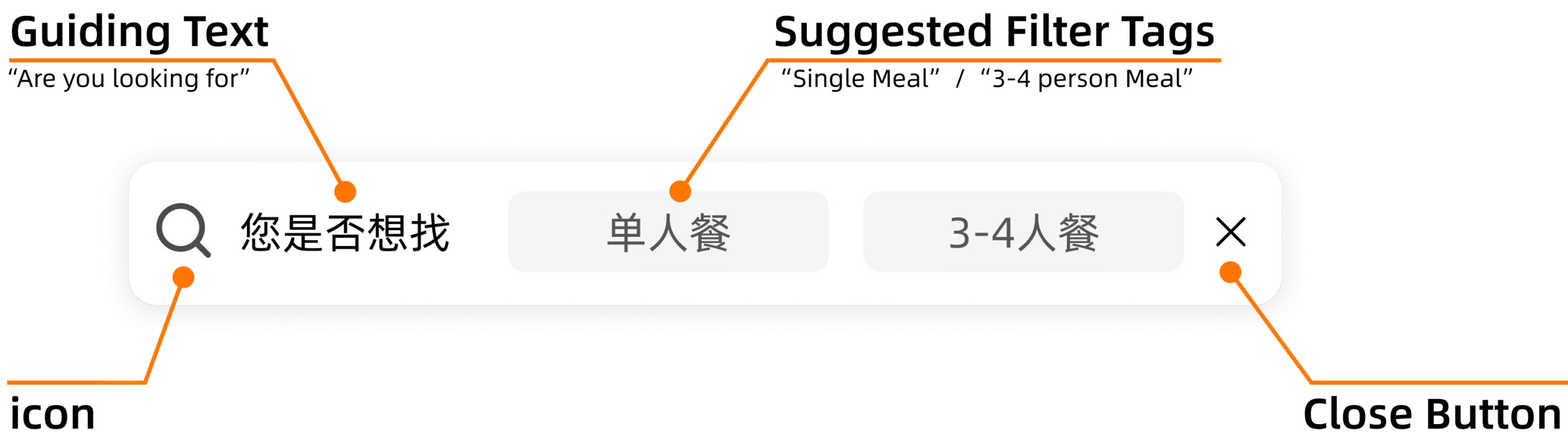
Component anatomy — the prompt surfaces a guiding text, 1–2 suggested filter tags based on browsing history, and a close button to dismiss for the rest of the session.
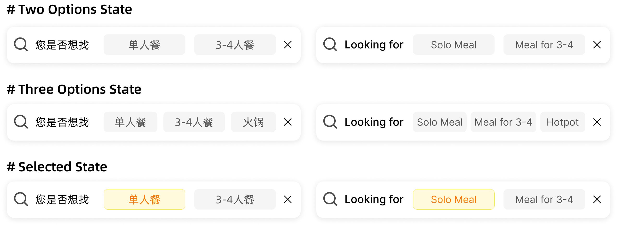
Three interaction states — two suggested filters, three suggested filters, and selected state with highlighted chip.

Shipped end-to-end flow — (1) User views a group-meal deal, (2) returns to list where the prompt appears below the last-tapped card, (3) taps a filter chip, (4) list refreshes with matching supply and filter applied.
Prompt CTR
Positive vs. baseline · A/B confirmed
Channel GTV
Positive contribution · A/B confirmed
Post-filter Purchase Rate
Consistent with party-size filter baseline
The more precise long-term solution is a behavioral model that reads a user's full in-session browsing pattern and adjusts the recall structure of the next page load accordingly — surfacing the right supply mix without requiring any explicit filter action. That kind of model takes six months to a year to build properly. This feature was the lightweight version: imperfect, but shippable in weeks, measurable in days, and good enough to validate that the intent signal is real and worth acting on.
04
Recommendation Reason Architecture
0→1 Lead
Even with better filters, users still faced a wall of cards that looked identical. But Direction 04 didn't start from scratch — it started from a signal the filter work had already validated. If users responded to "Locals' Choice" as a filter, the same signal belonged on the card. The filter narrowed the list; the card still had to close the deal.
The specific gap was between two supply types. Dining cards in the Tuangou feed had been iterated on for years — rich with menu highlights, ratings, and deal context. But lifestyle and entertainment cards (spas, KTVs, beauty services — the "integrated local services" category) had barely moved since the channel launched. Most of what they showed was fulfillment information: "refundable anytime," "no reservation needed." Useful for reducing purchase anxiety. Useless for helping a user choose between five nearly identical massage packages.
When every card says "refundable anytime," that's not a differentiator. It's table stakes. The card needs to carry the signal that actually separates one product from another.
I led the 0→1 design of an information architecture for these cards: auditing what signals were available across APIs, mapping them to the user's decision journey, assigning them to card positions, and designing a four-group A/B experiment to determine the optimal priority order.
Mapping signals to card positions
The card has four distinct positions, each with a different role in the decision process. The first step was auditing what signals were actually available — across three backend APIs — and mapping them against the user's decision journey: what drives initial attention, what supports comparison, what triggers the purchase, and what reduces final hesitation.
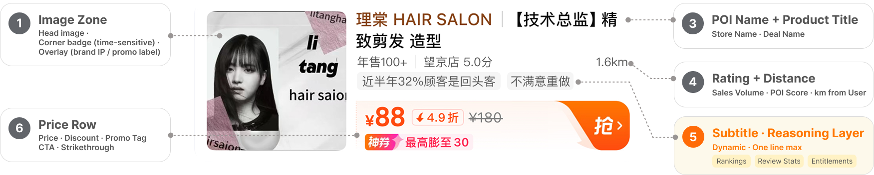
Product card information layers — from attention (title prefix) to reasoning (subtitle) to conversion (price row).
The priority problem: what goes in the subtitle?
The subtitle slot is one line. We had access to five categories of signals: sales volume (already there), rankings and endorsements, statistical review summaries, user purchase history, and service entitlements. All legitimately useful. None can all appear.
I designed a four-group A/B experiment to test two core questions: (1) Should endorsement signals (rankings) or behavioral signals (review stats) lead? (2) Does category-specific context (CPV tags) belong before or after endorsements?
| Group | Priority order in subtitle | Hypothesis |
|---|---|---|
| Group 1 | Sales volume → Rankings → Review stats → CPV → History → Entitlements | Endorsement signals anchor trust more than behavioral stats |
| Group 2 | Sales volume → Review stats → Rankings → CPV → History → Entitlements | Statistical signals are more persuasive than rankings |
| Group 3 | Sales volume → CPV → Rankings → Review stats → History → Entitlements | Category-specific context first, then endorsement |
| Group 4 ✓ | Sales volume → CPV → Review stats → Rankings → History → Entitlements | Category context + behavioral signals outperform endorsement-led ordering |
| Control | Sales volume only (existing) | — |
An additional consideration shaped one edge case: if a venue holds the "Must-Try List" designation (a high-authority Dianping IP), it gets elevated to the title-prefix position and exits the subtitle competition entirely — preventing redundant display and protecting the IP's signal value.
Entitlement signals: the decision that almost got cut
Service entitlements — refund policies, reservation conditions — were the most debated addition. The argument against: they're fine print, not discovery signals. Users don't browse for "refundable meals."
The argument for, which I made and held: entitlements don't drive initial interest, but they remove the final hesitation. For a high-ticket booking, "refundable anytime" is the difference between add-to-cart and close-tab. It belongs in the card — at the end of the priority stack, after intent is established, as a conversion enabler.
1
Sales volume — existing signal, maintained as anchor
↓
2
CPV (category-specific) tags — KTV room type, buffet time slot, etc.
↓
3
Statistical review signal — repurchase rate, recent buyer count, sentiment summary
↓
4
Ranking endorsement — local food rankings, platform lists
↓
5
User purchase history — "You've bought this before"
↓
6
Service entitlements — refund policy, reservation conditions
+1.3%
Daily paid GTV, restaurant supply (A/B confirmed)
+0.8%
Channel-wide daily paid GTV lift
+0.01pp
Purchase rate improvement
Overall results
Four directions, one system
The four directions compounded. Filter infrastructure → context-aware targeting → behavioral intent detection → card-level information. Each layer built on the prior one to close the gap between user intent and product discovery.
+9.2%
Filter UV click-rate, M3W4 → M7W3
+0.9%
Daily paid GTV (filter system, A/B cumulative)
+1.3%
Daily paid GTV (card info, restaurant supply)
The algorithm is a long-term bet. User-side product work is the short-term lever — if it's systematic enough to compound.
The most durable output wasn't any single feature. It was the decision infrastructure: a filter taxonomy, a card information framework, a data monitoring cadence, and experiment templates the team could reuse. These meant the next filter or card signal could be evaluated, shipped, and measured without starting from scratch.
Reflection
This was my first formal product role in a commercial environment. What surprised me wasn't the complexity — it was how directly prior experience transferred. User research instincts helped me read session data and surface latent needs that aggregate metrics missed. Design skills meant I could sketch a reference and give feedback at the component level, compressing the iteration loop with the design team. SQL and R experience meant I could explore behavioral data myself rather than wait for reports — which mattered most in Direction 03, where the key insight came from session-level patterns, not dashboards.
The boundary between PM and designer felt less relevant than I expected. Writing a spec, defining a data schema, running an A/B experiment, reviewing a build — these weren't handed off between roles. They were part of the same loop. As AI compresses execution and makes prototyping cheaper, I think range matters more than role definition. This project was a version of that in practice.
The direction I didn't finish — scene-aware filtering by identity and context — points toward where the real leverage is: not better filters, but a system that knows when to surface which signal to whom. That's a personalization problem. The product groundwork is there. It's waiting for the model to catch up.