Interactive Filter Bar Design for Meituan Group-Buying Channel
Product Design Intern
Key Contributions
Duration
- May 2025 – July 2025
Team
1 PM, 3 front-end, 1 back-end
Tools
Figma, SQL
-
Designed an interactive, context-aware filter bar from 0 → 1 to streamline product discovery in Meituan’s group-buying channel.
-
Collaborated cross-functionally with PMs, front-end & back-end engineers, and data analysts to align design decisions with business KPIs.
1.16
Gross Transaction Value (GTV)
0.56
Average Order Value (AOV)
0.03
Conversion Rate (CXR)
Background
Meituan is China’s leading local-life services platform, often likened to Uber Eats and DoorDash. The company offers food delivery and in-store deals across dining and leisure categories, and its annual transacting users already exceed 770 million with over 14.5 million active merchants.
Through its group-buying channel, users purchase discounted vouchers which must be redeemed at participating merchants within a set timeframe, spanning restaurants, entertainment venues and more.
Painpoint Definition
#1 Low Interaction Rate on the Filter Bar
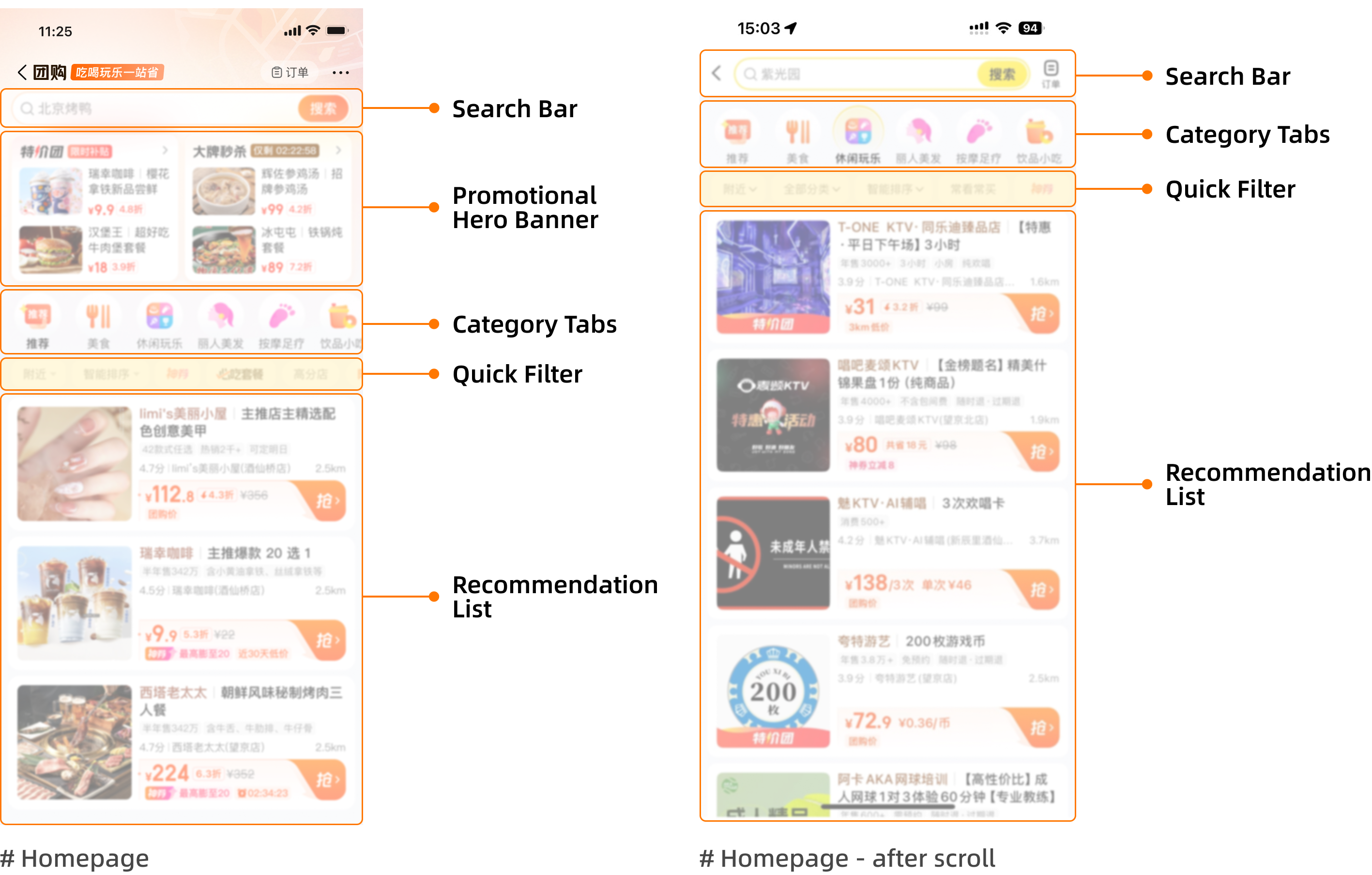
In Meituan’s group-buying channel / Food Tab, a single-row, horizontally scrollable quick-filter bar was designed to help users narrow down deals by category, price, or group size and so on.
However, behavioral analytics showed that although the click-through rate (CTR) of this feature had gradually increased after several iterations, it remained relatively low compared with other homepage touchpoints.
Based on clickstream data, user interviews, and session playback analysis, we found that many users either ignored the filter bar or used it only once per session. Most preferred to continue scrolling through the product feed instead of refining results, suggesting that the filter bar’s affordance and perceived usefulness were weak—users often viewed it as static decoration rather than an interactive tool.
#2 Complex Selection Layers and Mixed Content
Further investigation uncovered two deeper causes behind the low engagement.
First, the content feed in the dining category was overly mixed, combining low-priced drinks and snacks with full-meal options. Since users typically browse only a limited number of product cards before deciding, this diluted relevance and reduced motivation to filter further.
Second, applying a filter involved multiple operational layers—selecting a filter type, confirming, and waiting for page reload—creating friction for quick decision-making.
While improving the recommendation algorithm could theoretically address the issue, its development cost and iteration cycle were too high for short-term impact, making interaction-level redesign the most viable approach.
Design Goal

Given the low engagement rate and high interaction cost of the existing filter bar, our goal was to enhance product discovery and encourage more intentional use of filtering behaviors within Meituan’s group-buying channel.
We aimed not only to improve immediate usability, but also to gradually cultivate a user habit of expressing purchase intent through filters rather than endless scrolling. By strengthening the visibility and intuitiveness of the filter bar, we hoped to help users efficiently find what they need while exposing more high-value meal options—especially for users who previously focused only on low-priced snacks and drinks.
-
Reduce the number of steps required to reach meaningful filtering results.
-
Increase the discoverability and perceived usefulness of the filter bar.
-
Promote healthy filtering habits by making filters feel more contextual and rewarding to use.
-
Rebalance content exposure by guiding users from low-value snack items toward full-meal and group-dining deals.
Design Solution

Visual Design
-
The height of the filter bar was kept visually noticeable yet unobtrusive, ensuring users can still notice it while scrolling through long lists.
-
A “Cancel” button was added to give users control to dismiss the filter when it’s not relevant. Once canceled, it remains hidden for the rest of the session to avoid unnecessary interruptions.
-
The visual language follows a neutral black–white–gray palette, maintaining consistency with Meituan’s overall tone and preventing visual overload.
-
The selected state visually aligns with the existing quick-filter bar for consistency and user recognition.

Interaction Flow Design
#1 User Behavior Tracking
When users enter the detail page of certain meal-size deals (e.g., single meal or group meal) a set number of times, the system detects recurring interest and records the trigger condition.
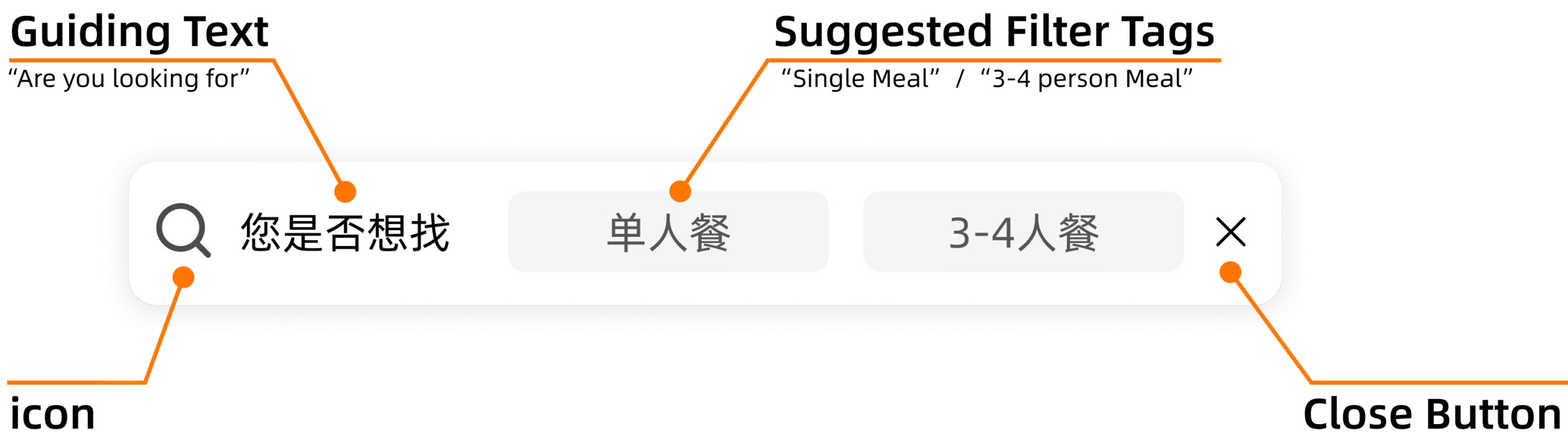
#2 Contextual Filter Bar Insertion
Upon returning to the recommendation list, the interactive filter bar appears dynamically.
It presents the 2-3 most frequently selected filter options based on the user’s recent browsing history to provide relevant shortcuts.
#3 User Selection & Loading State
After a user taps a suggested tag, the interface enters a brief loading state, communicating that new results are being generated.
Optional: If the user chooses Cancel, the filter bar will remain hidden for the rest of the current session to prevent unnecessary interruptions.
#4 Filter Synchronization & List Refresh
The system automatically syncs the selected tag with the corresponding quick-filter category, and refreshes the list from the top, showing results under that filter condition.
Cross-Functional Collaboration
With Product Manager
Worked with the PM to confirm appearance timing, component height, and visual style, ensuring the bar felt helpful but not intrusive.
Based on PM feedback, I refined font weight and button styles to align with Meituan’s design system.
Collaborated with front-end engineers to clarify interaction logic and ensure smooth transitions during implementation.
With Front-end Engineer
Worked with front-end engineers to confirm whether the feature should adopt a responsive layout across devices or follow separate design specs for each screen size.
After implementation, I reviewed the build during testing, checking visual consistency, component behavior, and overall alignment with the intended interaction flow before final release.
With Back-end Engineer
During the interaction design phase, we explored several approaches to minimize disruption to the browsing flow.
However, after discussing the implementation path with back-end engineers, we found that some solutions would introduce complex product recall and refresh logic in the recommendation feed.
To balance user experience and development feasibility, we finalized a low-cost solution that achieved the core interaction goal while remaining efficient to deploy.
Takeaways
-
Always look beyond the surface pain point to understand potential solution paths, then prioritize based on timeliness, ROI, and implementation feasibility.
-
Small and well-timed interaction patterns can effectively guide users to learn or form new habits — even subtle UI changes can influence long-term behavior.
-
Great design requires restraint: innovation should never overpower usability. Users should always feel in control and have the freedom to opt out at any stage.
-
Cross-functional collaboration with PMs and engineers is essential to balance design quality with development efficiency and ensure smooth delivery.